UI components library for the new admin app and design system
Kiteworks | Q4 – 2021 | Palo Alto, CaliforniaFraming
Identify user / business needs
Designers needed a library of UI components to be reused whenever they wanted to design for a workflow. The UI components should also be easy to update.
Developers needed a library of UI components in all their states to build an exact replica, so that any component can be reused thoughout the product graphical user interfaces.
The branding guidelines have been recently updated, and the product look and feel should leverage those guidelines.
Product definition
Kiteworks is a white-label B2B platform that can be partially re-branded without affecting accessibility. Being a white-label product implies the neutrality and simplicity to harmonize with any brand look and feel or be used out of the box without customization.
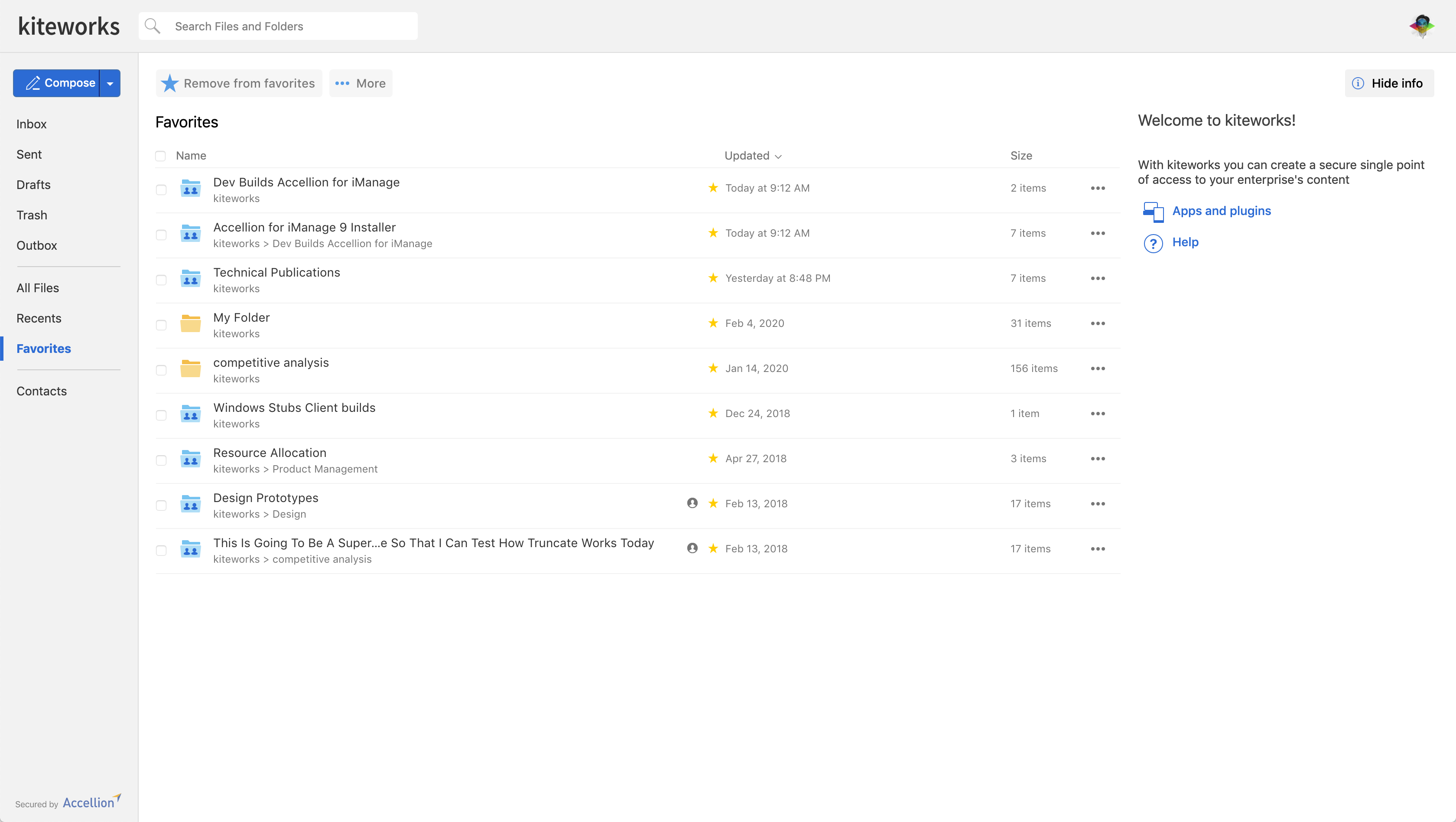
A project to improve the user experience of the admin console will serve as the first product to be built using the new UI components' library. The goal is to analyze every detail to optimize the look and feel of each and, as a result, the overall style of the library.
The components design will be leveraged from the existing look and feel of the end-user UI, given its adoption in recent years.
Process
Brainstorm
The design and development teams met a few of times to express their needs and ideas to approach the solution using different tools or styles.
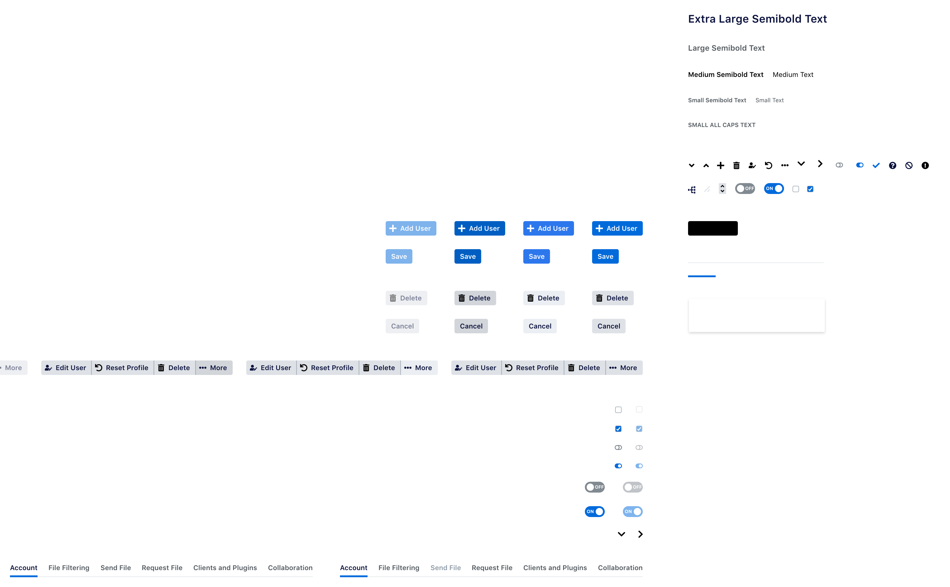
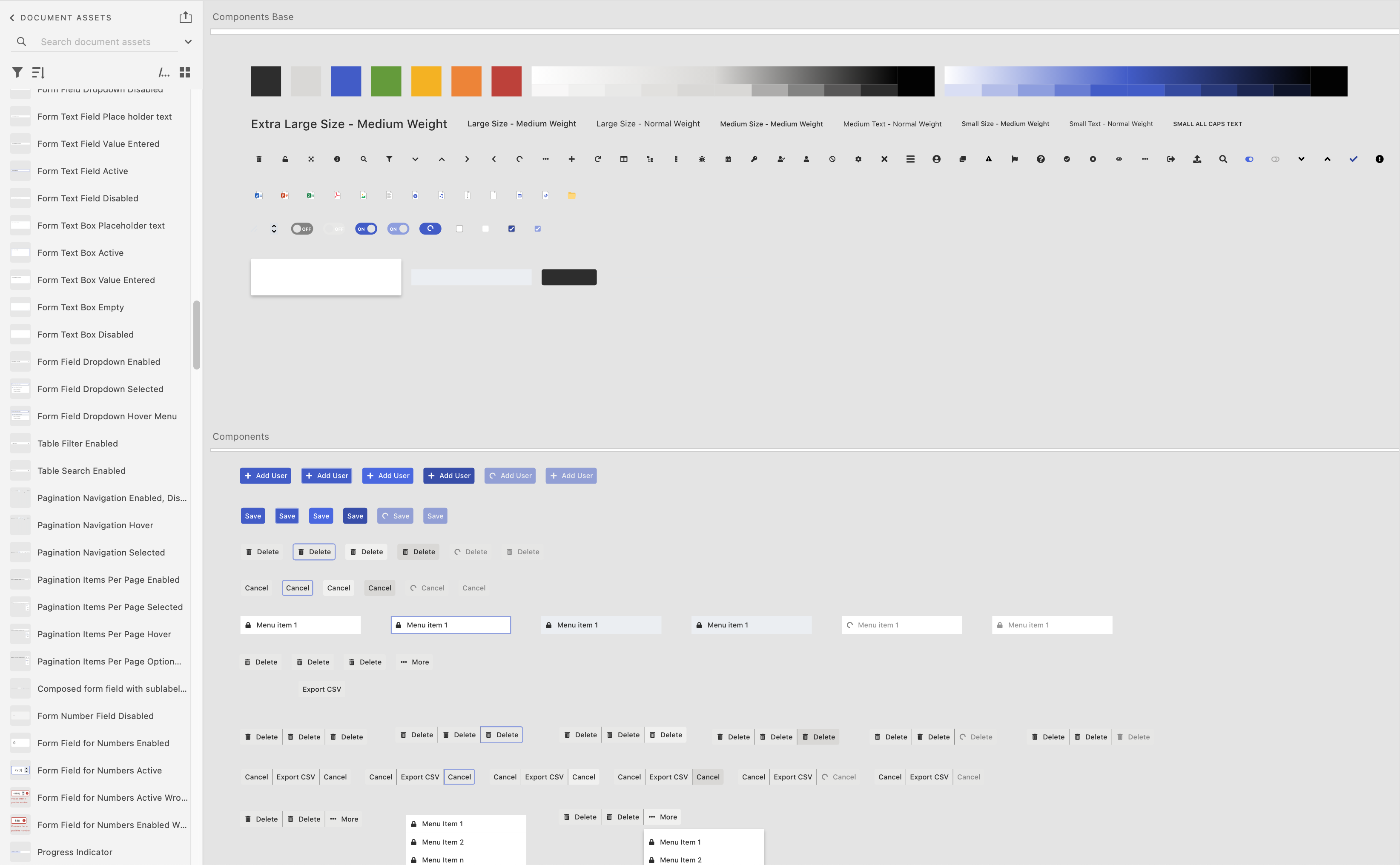
The design team decided to use the Adobe XD components design features to produce all the different states and compose the new admin pages. To store the library and enable the developers to inspect them for implementation details, the team decided to continue using Zeplin.
Team alignment
The teams agreed to buy a React template with basic pages and components included as a baseline to adapt to the new style and custom components.
The design team frequently met with the front-end team to ensure the progress met everyone's needs when designing and building different kinds of pages.
Design
Explorations
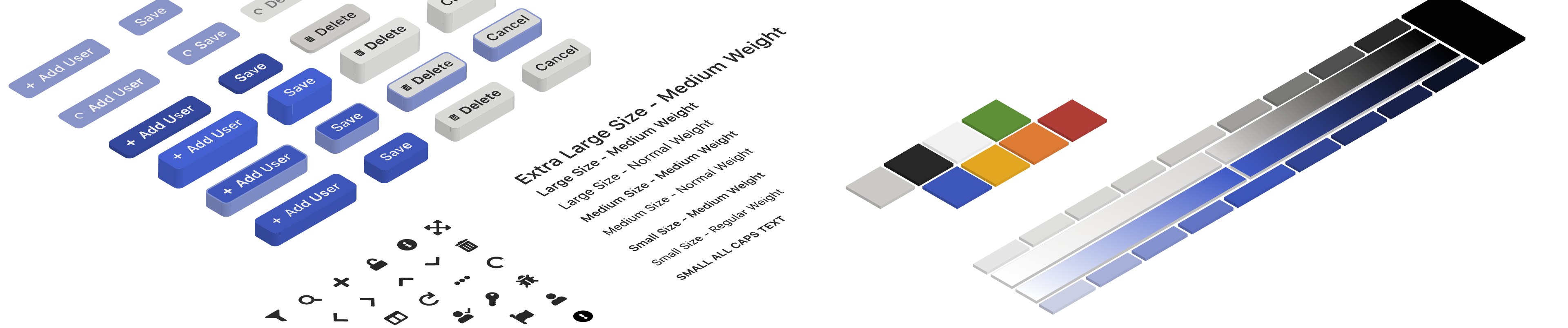
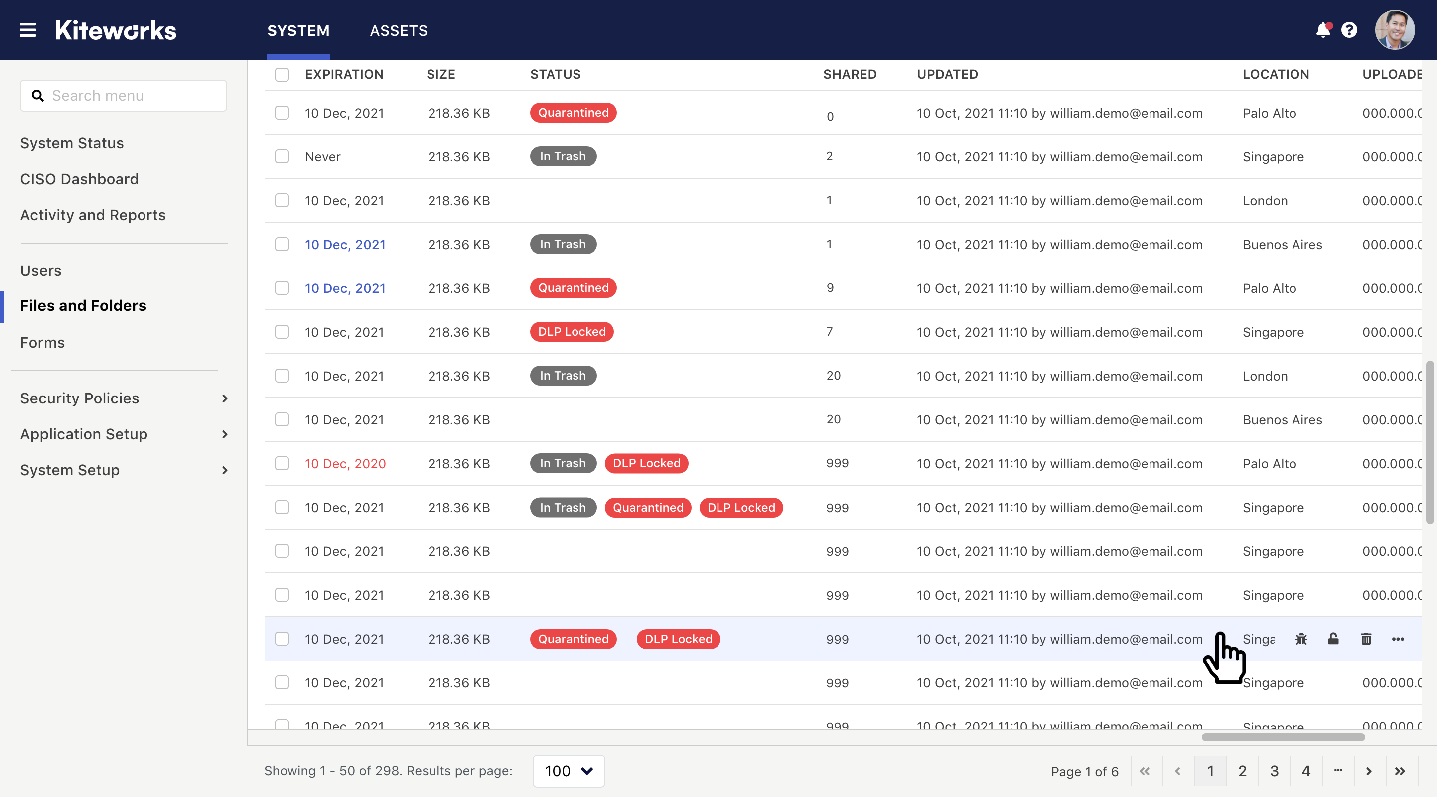
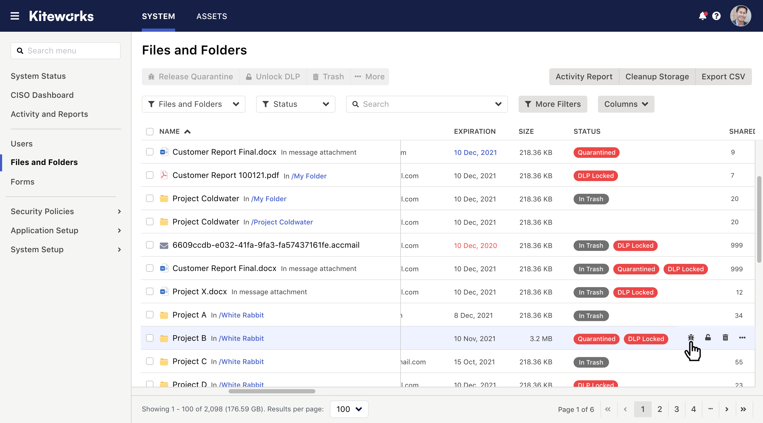
The first step I took was to capture screenshots of each page of the Admin UI to identify all the different kinds of UI components used throughout the Admin UI in context.
The engineering team had a plan to start with the form type of components. Therefore, I focus on developing those first and then the tables.
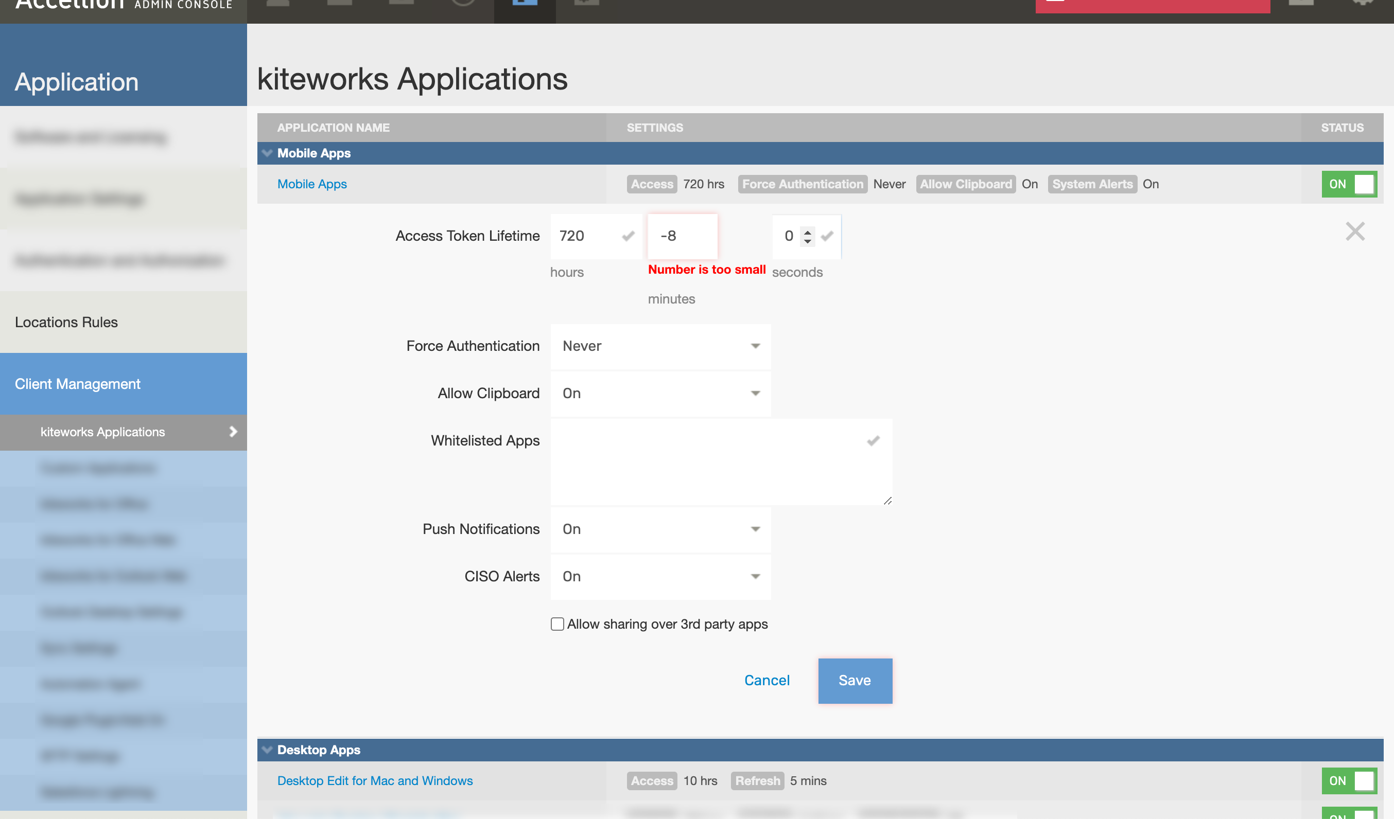
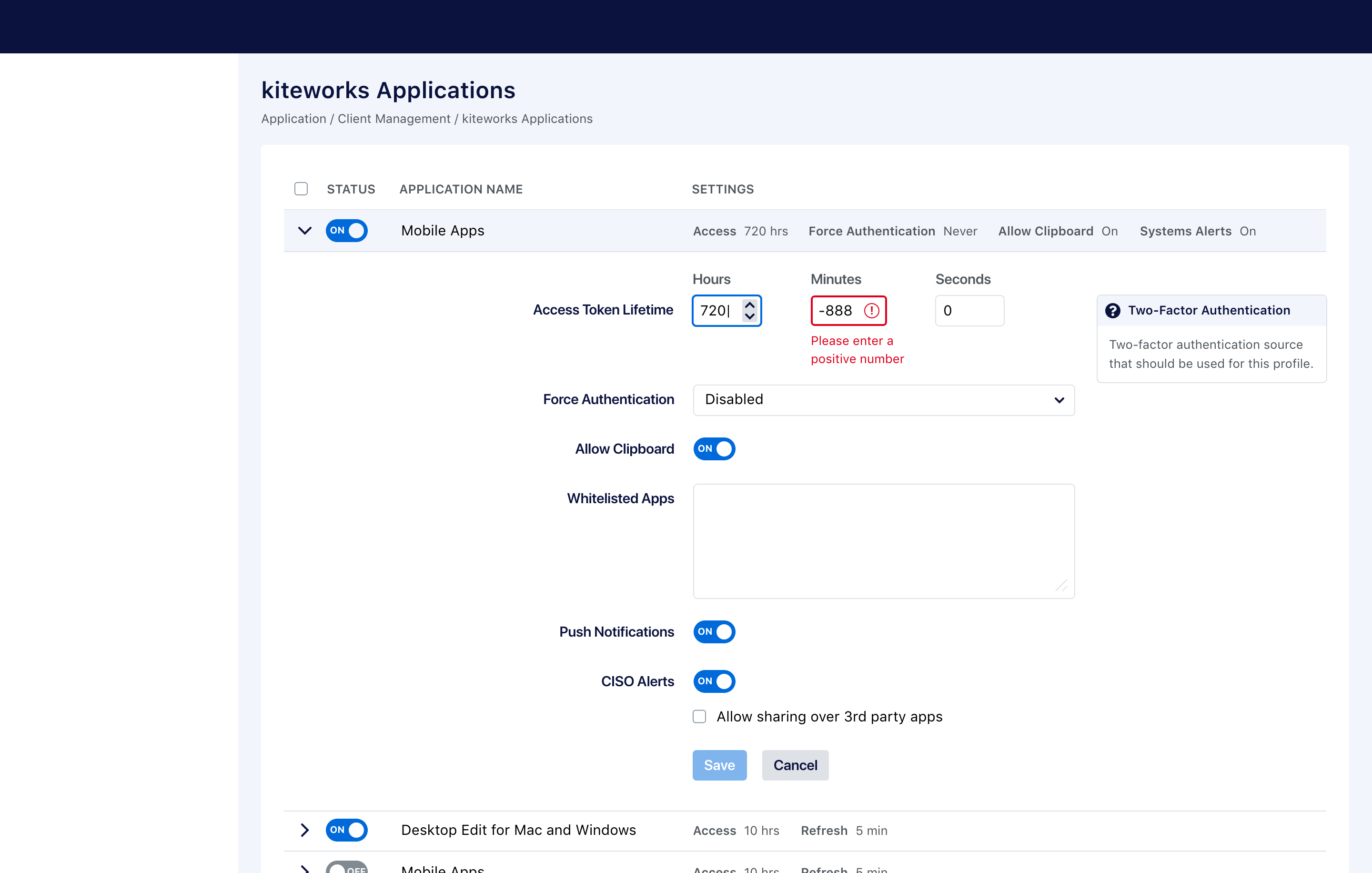
The first draft of the components was a replica of the original layout, only replacing the UI components for the new look and feel and minor improvements in the behavior throughout its states. The goal was to validate that the component's unique styles would work well together.
Iterations
When building each component from the ground up, the goal was to break it down to its fundamental parts and reuse as many rules across segments.
More elaborated components like tables were the most complicated due to their many possibilities for types of data and behavior needs, e.g., Some need a checkbox. In contrast, others need to expand and collapse control, but all are required to display data in a table format, optimizing for large amounts of data and quick access to controls.
Final solution
The final design results from the close collaboration with my design teammates on every detail, from the font size, margins, and colors of each component to the information architecture and usability across the system.
The final file improved the general guidelines we were using before, and it would optimize some new design needs in the future.
Reflection
Success metrics
As Steve Jobs famously said, "Real artists ship" from this perspective, the design and front-end teams were enabled to produce what they needed using the components and the documentation provided.
The admin UI redesign was a success across the organization and end-users; the library is ready to be extended to other Kiteworks user interfaces.
Learnings
Creating a library of components and a design system, for that matter, implies thinking in terms of simplicity, extensibility, usability, relationship with other elements, different states, etc.
The system is a never-ending project because the gaps in production and communication can constantly be improved.
Future iterations
The combination of Adobe XD for design and Zeplin for a handout to a developer was not very efficient due to the need to maintain two sources of truth. By the time we finished this project, Figma was starting to become the standard for UI design, so the team looked into the migration hoping to have only one source of truth for UI design and components and handing it over to developers.
I'm investing in learning Figma, especially now that the latest version in May 2022 includes powerful features to significantly reduce the number of versions of components like buttons, toats, etc. and support for responsive design. Figjam is also an excellent tool for brainstorming and documenting workflows.